The about page on this site says it’s a place to experiment, which is the polite version. The blunter one is that things change here, sometimes for the better and sometimes not, and the iteration is in public. Hero images are a good example. If you’ve been reading for any length of time, you’ve watched the style at the top of each post cycle through several distinct looks, and the cycling has not always been graceful.
The apology up front: the hero images before the five most recent ones were less consistent than they should have been. Different aesthetics from one post to the next, and a couple of flat or coloring-book outputs from the image model along the way. The most recent five reflect a process I’m finally satisfied with, and this post is the explanation for why they look like they belong to the same publication when the older ones sometimes didn’t.
The progression
The blog launched with no hero images at all. The first iteration added a shell script that called OpenAI’s image-generation API — gpt-image-1.5 at the time — to drop a small editorial illustration at the top of each post. The early style was soft watercolor washes. They looked fine in isolation but vague against the broadsheet typography, so I switched the default to simpler line art and got better results.
Through both eras, I passed an “anchor image” to the model on every generation, essentially telling it “match this.” That worked in the gpt-image-1.5 days. The anchor steered new images toward the blog’s existing visual language without overpowering whatever the post was actually about. The other thing I had to dial in during that stretch was the background color — getting the generated image’s background to match the site’s warm off-white in light mode and the near-black in dark mode took several iterations of post-processing in the script before it stopped looking like a sticker pasted onto the page.
When gpt-image-2 came out, I tried photorealistic editorial photos for a stretch. They were technically beautiful and editorially overwhelming. Five photos stacked on the homepage looked less like a blog and more like a magazine cover competing with itself for attention. I went back to line art.
The anchor experiment that didn’t work
The anchor approach broke down with gpt-image-2 in a way it hadn’t with gpt-image-1.5. Where the older model read the anchor as “style guidance,” gpt-image-2 read it as “this is also what the picture is supposed to be of.” A White House anchor would pull the next image’s subject into a federal-building scene regardless of what the prompt said. An office-interior anchor produced a vintage-camera default across three consecutive unrelated posts — an office, an imaging suite, and a container yard all came back looking like still lifes from an antique camera shop.
I spent several iterations trying to fix this through prompt engineering, telling the model the anchor was “technique only, not subject,” reweighting the language, and so on. It didn’t take. Empirically, the anchor wins the content war whether the prompt admits it or not. Some of the resulting hero images were flat. One came back looking like a page from a coloring book.
What works now
The current default is prompt-only. No anchor image. The script sends a long, explicit prompt — instructions about background color, line weight, monochrome rendering, detail density, shading, and 16:9 framing — and lets the model interpret it from there.
The output is more visually consistent across radically different subjects than the anchored version ever was. A recent locomotive hero, a log cabin hero, and an office-interior hero all look like the same illustrator drew them. That’s the prompt language doing the work, not an anchor.
The other thing that’s helped, and this is uncomfortable to admit, is that Claude Opus 4.7 writes a subject description for the image model better than I do. When I write one it tends to be terse: “two people at a desk.” When Claude writes one it specifies the angle, the time of day, what’s on the desk, what’s visible through the window, what the lighting suggests. The image model uses that detail. I do better work as the editor of the prompt than as the author of it.
The actual API call
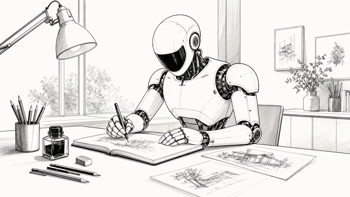
For anyone curious, here is the request that produced the hero image at the top of this post. The API key has been replaced with xs, and the prompt is shown with section headers and line breaks added for readability. The actual call sends the prompt as a single continuous string — JSON does not allow comments, and whitespace inside a string value is transmitted literally, so the structure shown here is documentation rather than something you could copy and run as-is. Only the # Per-image subject block changes between generations; everything else is the recurring template the script reuses.
curl https://api.openai.com/v1/images/generations \
  -H "Authorization: Bearer xxxxxxxxxxxxxxxxxxxxxxxxxxx" \
  -H "Content-Type: application/json" \
  -d '{
  "model": "gpt-image-2",
  "prompt": "

    # Recurring template (sent on every generation)

    Style: editorial line drawing — a refined architectural fineliner sketch or technical ink illustration suited to a broadsheet feature section.

    CRITICAL: The background MUST be exactly the hex color #fdfbf7 — a very light, warm off-white (RGB 253, 251, 247). NOT gray, NOT cream, NOT ivory. The entire background must be this single flat color with no gradients, no texture, no noise. All line work is drawn in near-black (#1a1a1a).

    MONOCHROME ONLY — the image uses three tonal values only: warm off-white background (#fdfbf7), near-black line work (#1a1a1a), and gray tonal shading between those two. NO color anywhere — no gold, brass, yellow, blue, red, green, or any hue. Naturally-colored elements (gold-leafed domes, brass fixtures, foliage, glass, signage) must still render in line and gray-scale shading only. The dark-mode variant is generated by color inversion, so any source color becomes its complement (gold → blue) and breaks the dark-mode output.

    LINE WEIGHT — use VARIED stroke weight, but keep every line bold enough to survive mobile downscaling to ~400 pixels wide. Major contours and primary structural lines run roughly 6 pixels wide at full resolution. Secondary details and interior structure run roughly 4 pixels. The finest internal details still hold at roughly 3 pixels — never thinner. NOT a cartoonist's uniform fat outline, NOT a coloring-book page's stamped border, NOT a comic panel.

    DETAIL DENSITY — this image will be displayed on phone screens at ~400 pixels wide. Dense fine repeating textures (mesh weave, perforated panels, fine louvers, wire grilles, intricate lattices, tight hatch fills) blur into gray smudges at that size and lose editorial clarity. SUGGEST such textures with a few sparse representative strokes plus negative space — do NOT render every individual line. Prefer larger, well-spaced detail elements over intricate fine pattern work. When in doubt, simplify.

    SHADING is welcome where it adds depth: parallel hatching, crosshatching, stippling, and light gray tonal washes are encouraged for cast shadows, recesses, foliage masses, and the undersides of overhangs. Use shading SELECTIVELY — the dominant treatment remains line work, with shading as accent. Do NOT shade every flat plane and do NOT turn the image into a uniform tonal study. NO solid black areas, NO comic-style silhouettes, NO heavy woodcut blocks; shading stays visibly composed of strokes, dots, or light gray fills, never solid masses. Think editorial newspaper illustration where line work and shading work together — an architect's ink-on-bristol drawing meets a broadsheet hedcut. Lots of negative space, editorial and unhurried.

    Compose the illustration for a 16:9 aspect ratio — keep all important content within a 16:9 safe area, centered, with nothing critical near the edges.

    # Per-image subject (the only part that changes between posts)

    Create a new 16:9 landscape illustration representing: a sleek modern humanoid robot seated at a desk in a quiet illustrator's studio, drawing line art in an open sketchbook with a fineliner ink pen held between articulated white fingers. The robot has a smooth pristine white composite shell with visible articulated mechanical joints at shoulders, elbows, wrists, and finger knuckles; an egg-shaped white head with a glossy dark visor-style faceplate and no visible facial features; two small circular sensor accents at the temples; a slim articulated mechanical neck between head and chest. The desk has pencils, an ink bottle, an eraser, and two or three preliminary sketches laid out beside the sketchbook. A task lamp arches over the work surface. A window in the background lets in soft daylight. Focused, calm, contemporary studio.

    # Recurring footer

    No text, no logos, no brand marks, no words.

  ",
  "size": "2048x1152",
  "quality": "high",
  "output_format": "png"
}'
The model is gpt-image-2. The size is 2048x1152, which is the native 16:9 the script targets before cropping to the 1200x675 the site actually serves. Quality is high. Output format is png, which the script then converts to WebP and JPG, generates a paired dark-mode variant via local color inversion, and saves the resulting five files for review before any of them get copied into the site.
The cost
This image cost $0.18 to generate.
That figure covers both the light and dark variants — the dark version is produced on my Linux laptop by inverting the same PNG before the post gets published to AWS S3, so one API call covers both. At one generation per post with an occasional reroll, the monthly hero-image spend doesn’t show up on the bill in any meaningful way. If I were generating dozens of variants per post and picking the best, the math would be different.
Going forward
Five posts in, the prompt-only approach is the right setup for this blog. The next time the hero images look inconsistent with what’s been going up lately, it will probably mean I’m experimenting again. The blog is a place to try things, after all. I’ll just try to apologize for it less.